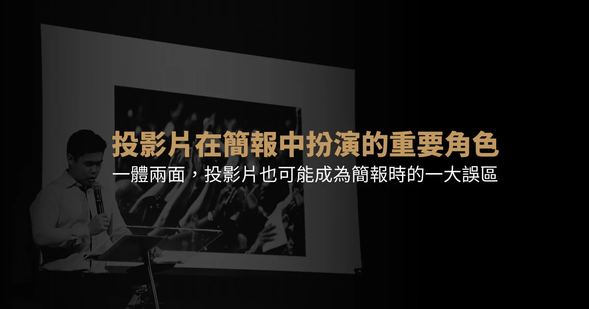


理解心理學的「切塊」概念,以應對資訊量超載的簡報。本文的兩個目的:(1) 傳遞強而有效的資訊 (2) 考慮聽眾的承受力

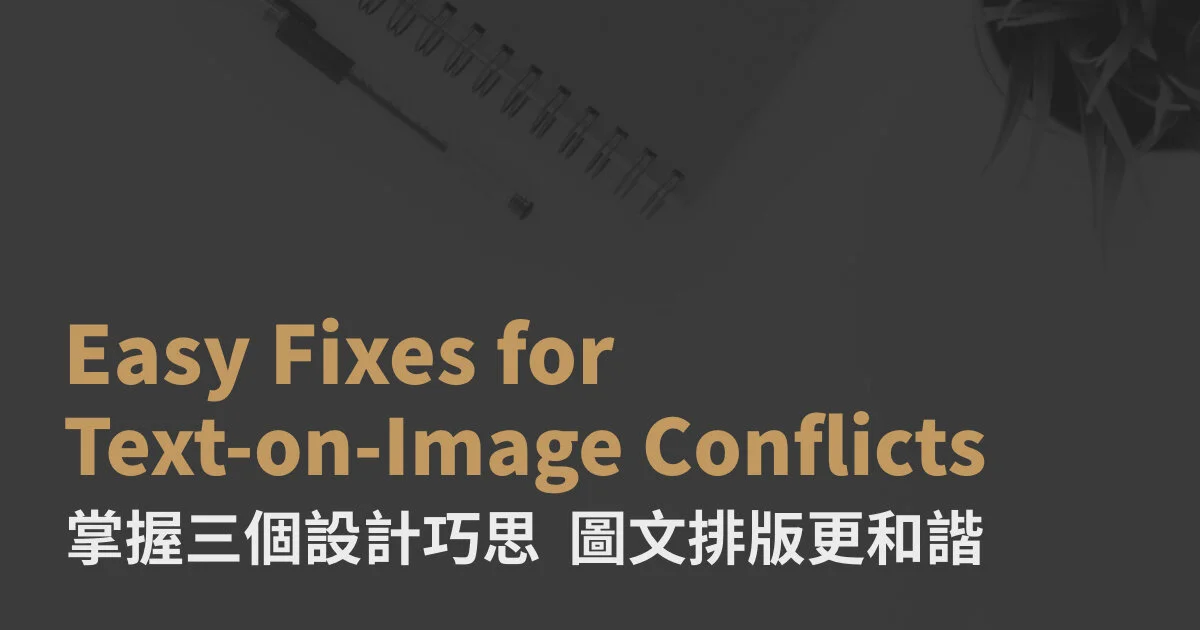
Have you ever had problems placing text on top of photos? The colors either clash on certain letters, or the placement is just off? You may not care so much, but in the pursuit of PowerPoint perfection, minute details sometimes matter. To that end, we will cover how to use transparency, shadows and/or photo selection to solve this issue.
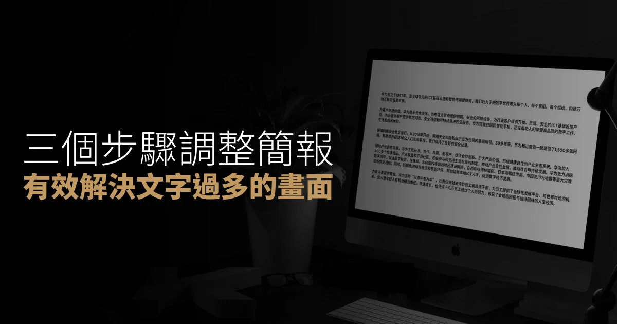
簡報中常會有把文字放在圖片上的排版,但要麼圖片顏色會把文字吃掉,要麼畫面過於豐滿而沒有地方放置文字。雖然不是特別大的問題,但為了追求投影片的完美,細節往往很重要。因此,這次將從透明度、陰影、挑選合適圖片這三點來和大家分享如何解決這個問題。